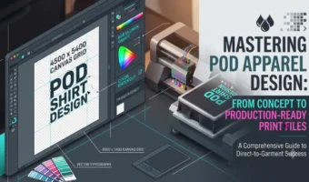
Mastering POD Apparel Design: From Concept to Production-Ready Print Files
About This Course
OVERVIEW:
This course provides a comprehensive dive into the end-to-end process of designing high-impact artwork specifically engineered for print-on-demand (POD) apparel. Designing for physical garments requires a fundamentally different approach than designing for digital screens or traditional print collateral. Throughout this curriculum, you will master the delicate balance between aesthetic appeal, market positioning, niche target psychology, and the strict technical constraints of direct-to-garment (DTG), direct-to-film (DTF), and screen printing fulfillment methods.
Designed specifically for graphic designers, digital artists, and online store owners who already understand graphic software basics, this program eliminates the guesswork that leads to muddy colors, pixelated prints, peeling transfers, or poor sales. You will discover how typography, illustration structure, color management, and garment placement work together to turn basic ideas into top-selling apparel products. We will move beyond generic templates into professional graphic production workflows that ensure every design looks vibrant on actual fabric.
By completing this course, you will transform from an artist who simply creates visuals into an expert apparel product designer. You will possess the technical authority to setup flawless 300 DPI vector and raster print files, select ideal color profiles for fabric, conduct rigorous niche market research, and structure high-converting t-shirt designs that sell consistently across major POD platforms.
LEARNING OBJECTIVES:
-
Analyze niche market trends and visual demand drivers to identify profitable t-shirt design concepts.
-
Execute proper canvas setups, color modes (CMYK vs. RGB), and physical resolution parameters tailored to DTG and DTF printing.
-
Construct balanced apparel compositions using hierarchy, focal points, and arched or framed typography principles.
-
Apply specialized vector and raster preparation techniques, including background removal, color knockouts, and halftoning.
-
Differentiate between physical print production methods (DTG, DTF, Dye Sublimation, Screen Printing) to optimize artwork parameters.
-
Formulate cohesive apparel color palettes that maintain contrast across light, dark, and heather fabric blends.
-
Produce production-ready print assets exported in correct formats, transparency settings, and dimensions (e.g., 4500x5400px at 300 DPI).
-
Design photorealistic, high-converting product mockups and marketing assets for e-commerce storefronts.
PREREQUISITES:
-
Intermediate proficiency in Adobe Illustrator, Adobe Photoshop, Affinity Designer, or equivalent graphic design software.
-
Fundamental understanding of visual design principles (contrast, alignment, typography basics).
-
Basic familiarity with print-on-demand platform concepts (e.g., Printful, Printify, Merch by Amazon, Shopify).
MODULE 1: Technical Foundations of Print-on-Demand Apparel Design ───────────────────────────────────────
MODULE OVERVIEW:
This module establishes the indispensable technical parameters required to create physical print products that translate perfectly from screen to cotton. Designing for apparel requires strict adherence to color management rules, pixel dimensions, and printer resolution standards. Ignoring these technical parameters results in blurry imagery, severe color shifting, and ruined inventory.
You will learn how modern direct-to-garment (DTG) and direct-to-film (DTF) printers interpret digital files, how to correctly setup master design documents in raster and vector programs, and how to control color profiles. Mastering these fundamentals guarantees that your final print assets are crisp, correctly scaled, and color-accurate every single time.
LESSONS:
Lesson 1.1: Document Setup, Resolution, and Dimensions
Setting up your working document correctly from the first click is non-negotiable in apparel design. For print-on-demand, the standard canvas size across major platforms like Printful, Printify, and Merch by Amazon is 4500 x 5400 pixels at 300 Dots Per Inch (DPI). This creates an effective printable area of 15 x 18 inches, which comfortably covers the chest print area of standard adult garments from size Small to 3XL.
Think of canvas size as the physical bounds of a printing plate. If you create a document at 72 DPI (web resolution) and try to scale it up to fit a t-shirt chest later, the computer has to invent pixels out of thin air, causing noticeable pixelation and soft, blurry edges on the finished shirt. Always start with native 300 DPI at full physical size.
When configuring your master template in Adobe Photoshop or Illustrator, set your color depth to 8-bit channel mode. Higher bit depths like 16-bit or 32-bit are ideal for photography editing, but print RIP software (Raster Image Processor) compresses these down to 8-bit anyway, which can cause unexpected color shifts during automated printing. Keep your working file structured with clear layers, isolated backgrounds, and preserved live type layers before exporting final flattened PNG assets.
-
Set your primary document canvas to 4500 x 5400 pixels at 300 DPI for universal POD compatibility.
-
Work at a 1:1 scale relative to physical garment dimensions to avoid destructive post-export scaling.
-
Maintain an 8-bit color depth structure to ensure RIP software renders graphics accurately.
-
Always keep a master working file (.PSD or .AI) separate from your flattened export files (.PNG).
Lesson 1.2: Understanding RGB vs. CMYK in Digital Apparel Printing
One of the most confusing aspects for beginner and intermediate print designers is managing the shift between RGB and CMYK color spaces. Traditionally, print production demanded strict CMYK files. However, modern DTG printing operators utilize advanced software (RIPs) optimized to accept sRGB profile files, converting RGB light values into textile ink drop combinations automatically.
Imagine RGB as light projected from a screen (additive color) and CMYK as physical ink dropped onto fabric (subtractive color). Neon colors, hyper-saturated cyan, and intensely luminous greens exist comfortably in the screen’s RGB space but cannot be recreated using real physical inks. When an out-of-gamut RGB color is printed, the printer replaces it with the closest available physical ink, which often turns a vibrant neon blue into a dull navy.
To prevent disappointing print results, build your artwork within an sRGB space while activating “Gamut Warning” tools in your software (e.g., Photoshop’s View > Proof Setup > Working CMYK). This overlays a grey highlight across any color on your canvas that physical textile inks cannot replicate. Adjust your color saturation and brightness until the warning disappears, giving you full control over how your colors appear once printed.
-
Design using the sRGB IEC61966-2.1 color profile, as required by major print-on-demand providers.
-
Understand that screen displays use additive light (RGB), while textile printers use physical inks (CMYK).
-
Use Gamut Warning tools regularly during color selection to flag unsaturable neon or luminous tones.
-
Avoid highly saturated, pure neon values that inevitably turn dull during garment printing.
Lesson 1.3: File Formats, Transparency, and Knockout Basics
The standard final file format for print-on-demand artwork is a 24-bit transparent PNG file. Unlike JPEGs, PNGs store exact alpha channel transparency data, allowing the background fabric of the t-shirt to show through everywhere artwork pixels are absent. Mastering transparency is key to creating soft-feeling, professional garments.
A common mistake is leaving a solid black or white background box behind a graphic. If you upload a square black graphic box onto a black t-shirt, the printer will drop a thick layer of white underbase ink, followed by black top ink over that exact box region. This creates a heavy, rubbery square on the customer’s chest—often referred to as a “bulletproof vest” print.
To make garments comfortable, breathable, and visual appealing, you must execute color knockouts. This means deleting specific colors (like black when printing on black garments) directly from your artwork file. The garment fabric itself then acts as that color element, saving ink costs, drastically reducing print stiffness, and creating a seamlessly integrated product.
-
Export final production graphics as 24-bit PNG files with transparent backgrounds.
-
Never leave solid background bounding boxes around graphics unless intended as part of the frame design.
-
Utilize color knockouts to let garment fabric act as part of the graphic color palette.
-
Test transparency layers over various fabric color mockups before uploading to production.
Lesson 1.4: Direct-to-Garment (DTG) vs. Direct-to-Film (DTF) Constraints
Understanding the difference between DTG and DTF printing technology dictates how you design edge transitions, opacity gradients, and microscopic details. DTG acts like an inkjet printer spraying liquid ink directly into fabric fibers. DTF prints artwork onto a transfer film, coats it with adhesive powder, and heat-presses the film directly onto the shirt.
DTG requires a white ink base coat on dark garments so top colors stay bright. Because DTG sprays liquid ink directly onto raw fabric, soft semi-transparent pixels (like outer glows, soft drop shadows, or low-opacity brush strokes) print terribly. The printer places white underbase under any pixel above 0% opacity, causing soft drop shadows to turn into solid white or grey halos on dark fabric.
DTF handles solid edge graphics and fine detail extraordinarily well on almost any fabric blend, but creates a thicker, less breathable transfer sheet. When designing for DTG, convert soft drop shadows and soft gradients into crisp vector shapes or crisp, hard-edged stippling/halftone patterns. Halftones break gradients into arrays of tiny solid dots, giving the illusion of a smooth gradient while providing clean, printable edges.
-
Recognize that DTG sprays liquid ink into fibers, while DTF applies a powder-bound film transfer.
-
Avoid soft, low-opacity drop shadows or glowing edges when preparing DTG files for dark garments.
-
Convert smooth raster gradients into halftone dot patterns to preserve smooth visual transitions.
-
Design with crisp, high-contrast edges to ensure maximum resolution output on both DTG and DTF.
PRACTICAL EXERCISE:
Create a technical master file template in your graphic software set to 4500 x 5400 pixels at 300 DPI using sRGB. Within this document, take an artwork file containing a soft drop shadow, remove the background completely, convert the soft shadow into a hard-edged halftone dot pattern, and perform a total color knockout of the background color (e.g., removing black from artwork meant for black shirts). Submit the final transparent PNG along with a screenshot of your document resolution settings and layers panel showing proper file structure.
📝 MODULE QUIZ — Test Your Understanding:
Q1: What is the industry standard canvas size and resolution for universal POD apparel design files?
A) 1920 x 1080 pixels at 72 DPI
B) 3000 x 3000 pixels at 150 DPI
C) 4500 x 5400 pixels at 300 DPI — ✅ CORRECT ANSWER
Explanation: Option C is correct because 4500 x 5400 pixels at 300 DPI provides an optimal print-ready resolution covering a standard 15 x 18 inch print surface at maximum print quality.
Q2: Why should soft, low-opacity outer glows and drop shadows be avoided in DTG design files for dark garments?
A) Printer RIP software automatically converts low-opacity pixels into solid white underbase ink, creating an unsightly halo — ✅ CORRECT ANSWER
B) Soft drop shadows cause the print head to clog during execution
C) Transparency files cannot be saved as PNG if drop shadows are present
Explanation: Option A is correct because DTG printers lay down a solid white ink underbase beneath any pixel that contains opacity, turning soft transparent gradients into solid white or grey patches.
Q3: What is the primary operational benefit of performing a “color knockout” on artwork designed for dark garments?
A) It changes the resolution from 300 DPI to 600 DPI automatically
B) It removes matching background color pixels, allowing fabric to show through and keeping the print soft and breathable — ✅ CORRECT ANSWER
C) It forces the printer to use RGB ink cartridges instead of CMYK
Explanation: Option B is correct because knocking out identical background colors reduces heavy ink layering on the garment, resulting in a softer feel and improved garment breathability.
───────────────────────────────────────
MODULE 2: Typography Engineering for Apparel ───────────────────────────────────────
MODULE OVERVIEW:
Typography on apparel serves a dual purpose: it acts as both a visual graphic element and a readable message. Unlike typography on print brochures or websites, t-shirt typography must be readable at a glance from across a room while matching the physical movement and shape of the human chest. Masterful typography is frequently the single defining factor between a top-selling graphic shirt and an amateur failure.
In this module, you will master font pair dynamics, visual weight distribution, text framing techniques, kerning adjustments for fabric, and expressive text distressing. You will learn how to turn plain text into dynamic graphic statements that look balanced, intentional, and aesthetically commanding.
LESSONS:
Lesson 2.1: Font Selection, Classification, and Personality Matching
Every typeface carries an immediate emotional signal. Select the wrong font personality, and your design’s core message completely falls apart. For example, using a delicate serif font for a heavy-duty outdoor rugged brand creates immediate aesthetic friction that turns off buyers.
When selecting fonts for apparel, group fonts by their primary emotional characteristics: Bold Sans-Serifs (modern, confident, clean), Vintage Display Serif/Slab fonts (established, authentic, historical), Script/Handwritten (personal, artistic, expressive), and Blackletter/Gothic (edgy, subcultural, technical).
Combine a maximum of two to three font families per design. A proven typography formula for apparel combines a strong, heavy Sans-Serif or Display font for the primary keyword with a secondary accent font (such as a script or light serif) for supporting text like “Co.”, “Established in”, or secondary slogans. Always ensure your primary keyword remains legible from a distance of at least 10 feet.
-
Match typeface emotional characteristics directly with your niche theme and target customer expectation.
-
Limit typography combinations to 2 or 3 contrasting font families per graphic.
-
Establish a clear visual hierarchy by making key power words significantly larger than secondary text.
-
Test legibility by zooming out to thumbnail size—if you can’t read the main word, adjust font weight.
Lesson 2.2: Text Manipulation: Arching, Bending, and Envelope Distortions
Flat, single-line horizontal text often looks incomplete or basic when printed across a t-shirt chest. To make text feel like a custom graphic artwork rather than typed text, professional apparel designers manipulate text geometry using envelope distortions, arches, and custom path curves.
Arched typography naturally follows the curvature of the chest and collarbone, creating a classic collegiate or athletic aesthetic. When arching text, avoid extreme arch angles that distort lettering beyond legibility. A subtle upper arch between 15% and 25% provides structural elegance while keeping baseline letterforms stable.
To create complex layout shapes (like wrapping text around a central emblem or fitting text into a shield), utilize vector Envelope Distort Shapes (Make with Top Object in Illustrator). Ensure that horizontal and vertical letter strokes don’t warp uncomfortably during warping—manually adjust anchor points to keep vertical letter stems straight and proportional.
-
Use subtle arching (15–25%) to align text naturally with human body shape and garment necklines.
-
Apply Envelope Distortion tools to fit text tightly into custom geometric vector badges or shields.
-
Keep letterforms proportional by correcting distorted vertical stems after applying warp effects.
-
Utilize text on path tools to wrap descriptive copy fluidly around badges and central illustrations.
Lesson 2.3: Kerning, Leading, and Spatial Balance on Garments
Text printed on fabric moves, folds, and shifts as the wearer walks. Standard character spacing (kerning) applied out of the box by design software is rarely optimized for large-scale garment printing. Tight, unadjusted lettering causes characters to bleed into each other during physical printing, turning letters like “R” and “N” into unreadable blocks.
Always perform manual kerning adjustments on primary headline text. Increase letter spacing (tracking) significantly when using ALL-CAPS text to create an elevated, high-end look. Conversely, when working with script fonts, keep letter strokes connected continuously—never apply wide tracking to script fonts, as disconnects break the handwritten flow.
Leading (line spacing) must be tightly controlled. On apparel graphics, stacked words should sit close together to form a cohesive, unified graphic block rather than floating loose lines of text. Tighten leading until line heights almost touch, ensuring the stacked text reads as a single shape.
-
Manually adjust kerning between letter pairs to prevent ink bleeding during physical printing.
-
Apply wide tracking to bold, uppercase sans-serif headers to achieve a polished layout.
-
Keep script font letters connected smoothly; never apply wide tracking to script typography.
-
Tighten leading on stacked text layouts to create a compact, unified visual block.
Lesson 2.4: Distress, Textures, and Vintage Typography Effects
Printers and customers love distressed typography because it creates a soft, worn, retro aesthetic that breaks up solid ink blocks. In addition to aesthetic appeal, distressing text makes prints physically softer on the chest because distressed cracks reduce the total ink mass applied to fabric.
To distress typography professionally, apply vector or raster distress masks over live text layers rather than applying destructive destructive filters. Knockout textures like subtle crackle, worn denim, or grainy woodcut using layer masks. Ensure your distress scale is optimized for 300 DPI; micro-distress textures that are too fine will fill in during printing, while overly large distress chunks completely chop off readable letter paths.
When creating vintage text effects, add secondary details like subtle drop strokes, inline offset paths, or shadow fills. Duplicate your text path, convert it to an expanded path, apply an offset path (e.g., +10px), and subtract it from your lower shadow layer to create a crisp, professional inline separation between the main text and its shadow.
-
Utilize non-destructive layer masks to apply vintage crackle and worn textures to text graphics.
-
Calibrate texture scale carefully so distressing remains crisp and legible at 300 DPI print scale.
-
Distress heavy solid text areas to reduce total physical ink coverage and improve garment softness.
-
Build inline separation paths using expanded vector offsets to keep shadows separate from primary text.
PRACTICAL EXERCISE:
Design a complete typography-driven apparel artwork layout for a fictional brand (e.g., “Pacific Crest Trail Co. – Outdoor Adventure”). The design must incorporate three distinct font pairings, an arched primary header, custom manual kerning, tight line leading, a secondary script accent, and a non-destructive distressed vector texture applied over the final art. Submit your editable vector file (.AI or .EPS) alongside a rendered PNG on a dark grey garment mockup.
📝 MODULE QUIZ — Test Your Understanding:
Q1: What is the primary visual risk of leaving default character kerning unadjusted on large apparel headline text?
A) The software will throw a font error upon PNG export
B) Letters may bleed together during printing, ruining legibility from a distance — ✅ CORRECT ANSWER
C) Color space will automatically revert from RGB to CMYK
Explanation: Option B is correct because physical textile ink spreads slightly when absorbed into fabric fibers, causing unadjusted, tightly spaced letterforms to blur together.
Q2: When designing custom text layouts, why should tracking (letter spacing) NEVER be widened on script typefaces?
A) Widening tracking disconnects the natural flowing entry and exit strokes of script lettering — ✅ CORRECT ANSWER
B) Script fonts are protected by copyright from spacing modifications
C) Printers cannot process tracked script fonts at 300 DPI
Explanation: Option A is correct because script fonts are specifically engineered to connect seamlessly from letter to letter; separating them breaks the continuous handwritten look.
Q3: How does applying a distressed texture mask to solid headline typography improve physical garment wearability?
A) It reduces the total ink applied to fabric, making the print softer and less rigid on the chest — ✅ CORRECT ANSWER
B) It prevents the garment from shrinking in the wash
C) It forces the printer to use glossy DTF transfers
Explanation: Option A is correct because distressed textures create micro-gaps in solid ink areas, allowing fabric to flex naturally and reducing heavy print stiffness.
───────────────────────────────────────
MODULE 3: Composition, Layout & Visual Hierarchy ───────────────────────────────────────
MODULE OVERVIEW:
A high-converting t-shirt graphic must look deliberate, well-proportioned, and balanced when worn on the human body. Unlike flat poster art or desktop screens, apparel graphics interact with natural chest contours, shoulder widths, and body movement. Poorly placed elements can create awkward visual focal points or make a shirt look cheap and unrefined.
This module teaches you how to structure apparel layouts using balanced visual anchors, geometric framing, crest vs. full-chest sizing, and optical centering principles. You will master the artwork structuring frameworks used by professional street-wear and apparel brands worldwide.
LESSONS:
Lesson 3.1: The Anatomy of Apparel Compositions
Apparel layouts rely on consistent compositional structures to guide the viewer’s eye. The four most successful layout frameworks in commercial apparel design are: The Shield/Emblem (contained geometric shape), The Stacked Block (heavy typography anchored top and bottom), The Centered Graphic Focal Point (central illustration bounded by arched copy), and The Minimalist Crest (small left-chest placement).
The human eye requires an immediate visual anchor. Identify your dominant primary element—whether it is an illustration or a powerful word—and construct secondary elements around it at a reduced scale. Maintain a strict visual hierarchy: Primary Focal Point (60% visual weight), Supporting Title/Sub-header (25% visual weight), and Fine Detail/Established Line (15% visual weight).
Always evaluate your visual weight distribution relative to the vertical center axis of the t-shirt. An unbalanced design that heavy on one side feels tilted when worn on a person’s chest. Use symmetrical framing elements like ribbons, crossed arrows, branches, or geometric borders to lock asymmetrical elements into a stable, eye-pleasing composition.
-
Structure layouts using proven frameworks like emblems, stacked blocks, or centered focal points.
-
Apply the 60/25/15 rule to establish a disciplined visual hierarchy across all design elements.
-
Maintain vertical symmetry across the chest center line to ensure balanced physical wearability.
-
Utilize secondary framing assets (ribbons, borders, stars) to lock dynamic graphics into cohesive shapes.
Lesson 3.2: Sizing, Print Placement, and Physical Human Scale
A design that looks massive on your monitor can look overwhelmingly huge or tiny on an actual physical garment. Understanding physical print scales across standard chest locations is vital for professional product execution. Standard print placement locations include Full Front (10×12 inches to 12×16 inches), Oversized Streetwear (14×18 inches), Pocket/Left Chest (3.5×3.5 inches to 4×4 inches), and Upper Back Neck (2×2 inches to 3×3 inches).
When sizing artwork for production, remember that a single graphic file size will be applied across shirts ranging from Small to 3XL (unless you pay for separate scale print runs). Size your master design so it sits comfortably on a Medium or Large shirt without extending into the armpits or tucking into pants waistlines.
When positioning a full front design, the top edge of the graphic should sit approximately 2 to 3 inches (or 3 to 4 finger-widths) below the collar neckband—never directly against the seam. For left-chest crest prints, place the center of the graphic over the vertical axis aligning with the collar edge, positioned horizontally aligned with the lower seam of the arm sleeve hole.
-
Size primary full chest graphics to fit comfortably within a standard 11″ x 14″ physical boundary.
-
Position upper edge of full front graphics 2 to 3 inches below the front collar neckband.
-
Align left chest crest graphics over the vertical line of the collar edge, parallel to lower armpit seams.
-
Avoid placing graphic details too close to side seams or bottom hem folds to prevent printing errors.
Lesson 3.3: Geometric Framing and Enclosure Techniques
Floating graphics—illustrations or typography floating aimlessly without clear boundaries—often look unrefined and cheap. Enclosing graphic elements inside geometric frames instantly transforms isolated graphics into a finished, retail-ready apparel badge or emblem.
Common frame shapes include circles, diamonds, shield badges, octagons, and rectangular borders. To integrate artwork into a frame naturally, allow key focal elements (such as an animal snout, mountain peak, or guitar headstock) to break out of the frame boundary slightly. This technique, known as “breaking the frame,” creates three-dimensional depth and dynamic visual energy.
When creating frame paths, maintain consistent border line stroke weights. If your primary artwork uses a 4-point ink line stroke, keep your outer framing borders at 4-point or 8-point stroke weights. Inconsistent stroke weights between frame and artwork create a disjointed design that looks like bad clipart.
-
Enclose loose text and graphic assets inside geometric frames to create cohesive emblem layouts.
-
Utilize “frame-breaking” techniques, letting key focal elements overlap frame borders to build depth.
-
Match outer frame line stroke weights proportionally with interior artwork stroke weights.
-
Apply offset double-lines or dashed line borders to add professional complexity to simple frames.
Lesson 3.4: Optical Centering vs. Mathematical Centering
Computers align graphics using mathematically precise bounding boxes. However, mathematical alignment often results in graphics looking physically crooked or unbalanced to human eyes. This occurs because transparent areas, extended letter tails (like ‘g’ or ‘y’), or long illustration elements shift the center of the computer’s bounding box away from the true visual center of gravity.
Optical centering is the manual adjustment of artwork placement based on visual human perception rather than alignment tools. For example, if a design features a heavy bear head on the left and a slender fishing rod extending out to the right, mathematical centering shifts the entire design far to the left. You must manually nudge the composition rightward until the visual weight balances visually across the center vertical guideline.
Always turn off software grid snap and test optical balance manually. Step back 6 feet from your display monitor, squint your eyes slightly to blur fine details, and evaluate where the dense visual mass sits. If the visual mass pulls to one side, manually shift the artwork until balance is restored.
-
Rely on optical centering over strict mathematical software alignment tools for final layouts.
-
Recognize that asymmetric artwork extensions shift mathematical bounding boxes off physical centers.
-
Test optical alignment by squinting at your screen from 6 feet away to evaluate visual mass distribution.
-
Manually nudge asymmetric compositions along the vertical guide until visual equilibrium is achieved.
PRACTICAL EXERCISE:
Create two contrasting apparel compositions using the exact same set of provided raw elements (1 illustration asset, 1 main slogan, 2 supporting text lines):
-
Layout A: A geometric emblem frame layout using “frame-breaking” depth techniques.
-
Layout B: An asymmetrical optical-centered layout built around a strong vertical focal point. Submit both artwork files placed correctly on full-garment 3D mockups, including marked guide lines showing vertical center axes and optical weight adjustments.
📝 MODULE QUIZ — Test Your Understanding:
Q1: What visual design outcome occurs when relying strictly on mathematical software alignment for asymmetric artwork?
A) The file automatically converts to 72 DPI
B) The design appears visually crooked or off-center on the garment due to uneven mass distribution — ✅ CORRECT ANSWER
C) The RIP software rejects the transparent PNG export
Explanation: Option B is correct because mathematical alignment measures extreme outer bounding box edges, ignoring where the actual visual weight of artwork sits, leading to visually skewed placement.
Q2: What is the recommended physical placement distance between the top of a full-chest graphic and the lower edge of a t-shirt collar seam?
A) 0.5 inches directly against the collar
B) 2 to 3 inches below the collar seam — ✅ CORRECT ANSWER
C) 6 to 8 inches down onto the stomach area
Explanation: Option B is correct because placing artwork 2 to 3 inches below the collar ensures the design sits flat across the chest muscle plane without riding up into the throat seam.
Q3: What is the purpose of allowing an illustration element to “break the frame” boundary in emblem layouts?
A) It tricks the DTG printer into using less ink
B) It creates dynamic visual depth and stops the graphic from looking like flat clipart — ✅ CORRECT ANSWER
C) It automatically scales the file for 300 DPI resolution
Explanation: Option B is correct because breaking frame boundaries creates dynamic overlapping planes, making artwork look custom-crafted rather than trapped inside a basic box.
───────────────────────────────────────
MODULE 4: Color Theory & Separations for Textiles ───────────────────────────────────────
MODULE OVERVIEW:
Color selection on physical fabric behaves drastically differently than color on glowing digital monitors. Fabric textures absorb light, white underbases shift color brightness, and printing over colored fabrics alters perceived color contrast. Mastering color theory and color separation for apparel ensures your printed shirts look rich, bright, and deliberate.
In this module, you will learn how to build cohesive limited-color palettes optimized for fabric, manage light vs. dark shirt contrast, execute manual halftones for shading, and perform simple spot color separations that keep printing costs low and output quality exceptional.
LESSONS:
Lesson 4.1: Textile Color Palettes and Fabric Interaction
Designing for textiles requires restricting color palettes. While digital screens render millions of colors effortlessly, physical apparel design excels when restricted to 2 to 5 deliberate colors. Limited color palettes reduce production complexity, lower printing costs, and yield a clean, iconic aesthetic.
When choosing colors, consider the physical fabric background as an active, free color in your palette. For instance, if you are designing for a heather gray t-shirt, use the gray fabric itself to supply middle shadow tones across your illustration by knocking out those areas.
Always account for how fabric dye mixes with ink underbases. Dark garments require a white ink underbase layer, which makes top colors appear brighter and slightly cooler. Light garments (white, cream, silver) take ink directly into the fibers without an underbase, resulting in softer, vintage-style ink absorption.
-
Limit apparel artwork palettes to 2 to 5 well-defined colors for maximum visual punch and lower print costs.
-
Treat the underlying garment fabric color as an active element in your graphic color scheme.
-
Understand that white underbases on dark shirts make top ink colors pop, while light shirts absorb ink softly.
-
Avoid using subtle 2% color variations; make color contrast deliberate and bold so it translates on fabric.
Lesson 4.2: Contrast Management: Designing for Dark vs. Light Garments
A common trap for print designers is taking a single design file and uploading it unchanged onto both black and white garments. A design configured with black text and dark shadows looks great on a white shirt, but completely disappears into a black shirt, leaving only isolated light elements visible.
To solve this, build dedicated light-garment and dark-garment file variants. For dark garments, perform a color inversion on typography and outline strokes, changing dark outlines to white or light cream. Ensure that key structural outline layers maintain outer contrast against the dark background.
Pay close attention to eye and face elements in character illustrations. If you invert artwork colors on a dark garment without careful adjustment, human faces and animal eyes will appear inverted like a photo negative (white pupils with dark whites of the eyes). Always manually preserve correct interior eyes and skin highlights when adapting graphics for dark fabrics.
-
Never use a single unadjusted file across both light and dark garment colors.
-
Create specific light-garment and dark-garment variants with adjusted line work and text colors.
-
Invert dark outlines to light outlines when converting designs for dark shirts while maintaining shadow integrity.
-
Protect character features (like eyes and teeth) during color inversions to prevent photo-negative errors.
Lesson 4.3: Halftones, Stippling, and Smooth Shading
Smooth photographic gradients created in Photoshop cause severe printing problems on DTG printers if left as raw pixels. The printer underbase software struggles to determine where to lay down tiny white underbase ink dots in low-opacity gradient tails, leading to speckled white ink noise around your art.
The professional solution for smooth textile gradients is converting continuous tones into Halftones or Stippling patterns. Halftones represent continuous gradients by using arrays of solid dots that vary in size. Because every halftone dot is 100% solid ink, the printer lays down clean white underbase and vibrant top color without any low-opacity confusion.
To create halftone gradients in Photoshop, convert your shading channel to a Bitmap mode using a Frequency between 30 and 45 Lines Per Inch (LPI) at a 45-degree angle. For a retro, hand-drawn look, utilize stipple brushes—arrays of hand-placed tiny dots—to build shading manually while maintaining crisp 100% vector edges.
-
Convert smooth raster gradients into halftones or stipple patterns for clean textile printing.
-
Use halftone frequencies between 30 and 45 LPI to ensure dots print crisply without filling in on fabric.
-
Set halftone screen angles to 45 degrees to create visually pleasing gradient transitions.
-
Ensure every dot within a halftone or stipple shade is 100% solid opacity with zero feathering.
Lesson 4.4: Spot Color Separation Basics for Screen Printing & DTF
While DTG prints digital files directly, traditional Screen Printing and modern DTF transfer production rely on clean spot color separations (separating an artwork file into individual solid black and white channel masks for each ink color). Understanding basic color separation principles guarantees your vector artwork is production-ready.
To build spot color separated files, every color in your artwork must be assigned as a distinct Spot Color Swatch (e.g., Pantone Solid Coated colors) rather than process CMYK mixtures. This allows software to generate separate channel plates automatically.
When vector shapes meet, apply small overlapping border edges called “Trapping” (typically 0.5pt to 1pt strokes). Trapping prevents tiny white gaps from appearing between adjacent color shapes on fabric if the printing press shifts slightly during physical production.
-
Assign Pantone (PMS) Spot Colors to all vector artwork elements to prepare for spot separations.
-
Utilize color channel panels to inspect individual color masks for unwanted color bleeding or stray pixels.
-
Apply 0.5pt to 1pt trapping overlays to prevent bare fabric gaps between adjacent print colors.
-
Keep vector shapes clean and expanded, eliminating unexpanded live effects before final handoff.
PRACTICAL EXERCISE:
Take a full-color raster illustration containing smooth gradients and convert it into a production-ready, 3-color spot separation file. You must:
-
Reduce the full-color image into a 3-color palette (e.g., Cream, Orange, Dark Navy).
-
Convert all smooth continuous shading areas into a clean 35 LPI halftone dot pattern.
-
Create two file exports: one optimized for a White garment and one inverted/adjusted for a Black garment. Submit both PNG exports alongside your Photoshop layer channel stack showing clean color separation masks.
📝 MODULE QUIZ — Test Your Understanding:
Q1: Why are smooth, low-opacity raster gradients problematic when printed via DTG on dark garments?
A) Smooth gradients automatically double the resolution to 600 DPI
B) Underbase software creates unwanted white ink speckling where pixels fade below full opacity — ✅ CORRECT ANSWER
C) Continuous gradients cause DTG inks to wash out completely in the first wash cycle
Explanation: Option B is correct because automated RIP software struggles to calculate white underbase ink distribution under semi-transparent gradient pixels, resulting in noisy white ink artifacts.
Q2: What halftone frequency (LPI) range is recommended for apparel textile printing to prevent halftone dots from blurring together on fabric?
A) 10 to 15 LPI
B) 30 to 45 LPI — ✅ CORRECT ANSWER
C) 100 to 120 LPI
Explanation: Option B is correct because 30 to 45 LPI yields dot sizes that are large enough to maintain clean spacing on cotton fabric fibers without filling in with liquid ink.
Q3: What is the purpose of applying “Trapping” (small stroke overlaps) to adjacent colors in screen print design files?
A) It prevents tiny white gaps from appearing between printed colors if the garment shifts slightly during printing — ✅ CORRECT ANSWER
B) It forces the printer to apply a glossy DTF top coat
C) It automatically converts CMYK colors into RGB light profiles
Explanation: Option A is correct because trapping extends adjacent color edges slightly, ensuring that minor physical press misalignments do not reveal raw fabric gaps between ink layers.
───────────────────────────────────────
MODULE 5: Market Research, Niche Validation & Trend Analysis ───────────────────────────────────────
MODULE OVERVIEW:
Even technically perfect artwork will fail to sell if there is no market demand for the concept. Commercial apparel success requires understanding customer psychology, subculture visual languages, search volume data, and emerging design trends. Designing for print-on-demand is as much about market validation as it is about artistic expression.
In this module, you will learn how to conduct deep niche market research, identify passionate passionate buyer subcultures, analyze competitor graphic approaches, detect emerging visual aesthetic trends, and create targeted designs engineered to convert browsing shoppers into paying buyers.
LESSONS:
Lesson 5.1: Identifying High-Intent Buyer Niches and Subcultures
Broad, generic shirt designs like “I Love Dogs” or “Music is Life” fail because they compete in overcrowded markets with millions of existing products. High-converting POD designs target specific, cross-niche subcultures with high buying intent—for example, “German Shepherd Agility Training Enthusiasts” or “Vintage Synth Analog Synthesizer Collectors.”
Look for niches where passion, identity, and community belonging drive buying behavior. People buy t-shirts to broadcast their personal identity, beliefs, humor, and hobbies to the world. When a design speaks directly to a specific subcultural identity, the customer feels personally understood and buys immediately.
Utilize cross-niche combination strategy (intersecting two unrelated niches) to create unique, low-competition concepts. Combine a profession with a hobby (e.g., “Welder by Day, Bass Fisherman by Night”) or an aesthetic style with a subculture (e.g., “Synthwave Aesthetics applied to Retro Gardening”). Cross-niching drastically reduces direct competition while speaking to specific buyer segments.
-
Avoid broad, oversaturated categories; target specific subcultures with strong personal identity drivers.
-
Recognize that people purchase apparel to express identity, humor, pride, and group affiliation.
-
Apply cross-niche combination strategies (e.g., Profession + Hobby) to create low-competition designs.
-
Validate niche passion by checking active social media groups, forums, and specialized online communities.
Lesson 5.2: Commercial Trend Spotting and Aesthetic Movements
Design styles move in cycles. What sold five years ago (like heavy distressed grunge text) may look dated today, replaced by emerging visual movements like Y2K Cyber Aesthetics, Retro 70s Groovy Typography, Minimalist Botanical Line Art, or Japanese City Pop Vintage Illustrations.
To spot trends before they peak, monitor visual platforms like Pinterest, Behance, Dribbble, and Instagram, alongside retail brand leaders like Urban Outfitters, PacSun, and ASOS. Pay attention to recurring color palettes, font choices, illustration styles, and overall mood across retail brands.
Distinguish between short-lived viral micro-trends (which spike and die in weeks) and broad, lasting aesthetic movements (which sustain sales over years). Build core catalog foundations around lasting aesthetic movements, while leveraging quick micro-trends for seasonal sales spikes.
-
Monitor major retail brand catalogs regularly to spot commercial graphic design trends early.
-
Track visual platforms like Pinterest, Behance, and Instagram for emerging visual styles.
-
Distinguish between short-lived viral meme trends and long-term commercial aesthetic movements.
-
Adapt winning visual styles (e.g., 70s groovy curves, Y2K cyber grids) to your core niche subjects.
Lesson 5.3: Competitor Analysis, Keyword Demand, and Search Intent
Before opening your design software, conduct thorough market demand and search volume analysis. Tools like Etsy Search Auto-complete, Amazon Merch keyword tools, Google Trends, and specialized POD analytics software (e.g., Flying Research, Producer) reveal what shoppers are actively searching for in real-time.
Analyze top-selling competitor listings within your target niche, paying close attention to their weaknesses. Look for top listings that have high sales rank despite poor visual execution, bad typography, or outdated design quality. These gaps represent prime commercial opportunities where superior design quality can dominate the market.
Identify high-intent keywords and phrase variations buyers use when searching for products. Incorporate these validated phrases into your typography layouts while ensuring the visual style matches the emotional tone of the search query.
-
Utilize search auto-complete and research software to validate real search demand before designing.
-
Analyze top-selling competitor designs to identify gaps in visual quality, typography, and execution.
-
Target keywords with proven buyer search volume but weak visual competition.
-
Ensure the visual mood of your design aligns directly with the search intent of the phrase.
Lesson 5.4: Intellectual Property, Copyright, and Trademark Safety
Nothing destroys a print-on-demand business faster than copyright and trademark infringement. Ignorance of intellectual property laws is not a legal defense. Uploading designs containing trademarked brand names, movie quotes, sports team logos, or copyrighted characters results in immediate account suspensions and potential legal liability.
Understand the strict difference between Copyright (protection of original artistic expressions like drawings, photos, and text) and Trademark (protection of brand identifiers, logos, catchphrases, and commercial slogans). While you cannot draw Mickey Mouse (Copyright), you also cannot print the phrase “Just Do It” on a shirt (Trademark).
Before publishing any text or phrase, search official trademark databases like TESS (USPTO) or regional IP registers to verify that the phrase is not registered under Class 025 (Apparel/Clothing). Never copy another artist’s work directly—always create original vector artwork and unique visual compositions inspired by general concepts, not specific references.
-
Always search official trademark databases (e.g., USPTO TESS under Class 025) before using phrases.
-
Understand that Copyright protects artistic expressions, while Trademark protects brand identifiers.
-
Never use brand logos, movie quotes, song lyrics, sports team references, or celebrity likenesses.
-
Create original artwork and compositions; use competitor work only for concept inspiration.
PRACTICAL EXERCISE:
Conduct a full commercial market research report for a prospective t-shirt line. Your submission must include:
-
Identification of a specific cross-niche target market with rationale.
-
Screenshot evidence of search auto-complete demand and competitor gap analysis.
-
Official USPTO TESS trademark clearance search proof for your chosen design phrase under Class 025.
-
A mood board containing 5 retail design inspirations establishing the visual aesthetic trend (colors, fonts, illustration style) you will target.
📝 MODULE QUIZ — Test Your Understanding:
Q1: What is the primary strategic benefit of utilizing a “cross-niche” approach (e.g., combining two distinct subcultures) in t-shirt design?
A) It eliminates the need to create 300 DPI files
B) It creates unique, highly targeted concepts with lower direct market competition — ✅ CORRECT ANSWER
C) It allows the use of trademarked logos legally
Explanation: Option B is correct because cross-niching combines distinct customer interests into a specific product, bypassing saturated single-topic categories.
Q2: Which international trademark classification code specifically governs apparel, clothing, and printed headwear products?
A) Class 009
B) Class 025 — ✅ CORRECT ANSWER
C) Class 042
Explanation: Option B is correct because Class 025 is the official Nice Classification category covering clothing, footwear, and headwear in trademark databases worldwide.
Q3: When conducting trademark safety checks for a t-shirt design slogan, which tool or database should be consulted first?
A) Google Image Search
B) Official USPTO TESS database (or equivalent regional IP database) under Class 025 — ✅ CORRECT ANSWER
C) Wikipedia slogan lists
Explanation: Option B is correct because official intellectual property databases like USPTO TESS provide legal records of registered commercial trademarks registered specifically for apparel products.
───────────────────────────────────────
MODULE 6: Production-Ready Exporting, Mockups & Store Launch ───────────────────────────────────────
MODULE OVERVIEW:
The final stage of the POD design workflow is turning finished digital artwork into production-ready store listings. Even brilliant designs fail to convert online shoppers if presented on poor, unrealistic mockups or configured incorrectly within POD platform upload systems. Your product listing presentation must match top retail brands to build instant trust.
This final module covers mass-export automation routines, alpha channel transparency verification, high-converting realistic mockup creation, store front catalog presentation, and building a scalable product asset library.
LESSONS:
Lesson 6.1: File Optimization, Batch Exporting, and Asset Management
When running a commercial print-on-demand store, efficiency is essential. Manually saving and exporting hundreds of design variants, color profiles, and canvas sizes one-by-one creates massive operational bottlenecks and introduces human error.
Build automated batch export workflows using Photoshop Actions, Illustrator Asset Export panels, or batch processing scripts. Set up master export presets that automatically generate 4500 x 5400 px transparent 24-bit PNGs, color-inverted variants, trimmed crest assets, and low-resolution web previews simultaneously with a single click.
Maintain a strict, standardized file naming convention across your local master archives and cloud backups. Use a structured format like: [Niche]_[DesignName]_[GarmentColorTarget]_[Version]_[Date].png (e.g., Outdoors_CampMoreWorryLess_DarkGarment_v1_2026.png). This eliminates confusion when uploading master files to POD fulfillment platforms.
-
Construct automated batch export actions to generate transparent PNG assets rapidly.
-
Export graphics strictly as 24-bit transparent PNGs with alpha channels preserved.
-
Establish strict, standardized file naming protocols to keep catalog archives organized.
-
Verify exported PNGs against dark backgrounds to check for stray semi-transparent pixels before uploading.
Lesson 6.2: High-Converting Realistic Garment Mockups
In e-commerce, customers cannot touch or try on your shirt—they buy entirely based on your product imagery. Cheap, flat, obviously computer-generated mockups reduce trust and drastically lower conversion rates. High-converting listings utilize photorealistic mockups featuring natural fabric folds, soft shadows, real models, and authentic lifestyle contexts.
When placing artwork onto PSD smart-object mockups, apply Displacement Maps (PSD files created from the target garment’s fabric texture). A displacement map warps the vector art along the realistic bumps, folds, and wrinkles of the shirt fabric, making the print look physically integrated into the fabric rather than lazily pasted on top.
Adjust the opacity and blend mode of your artwork layer on mockups. Pure digital artwork pasted at 100% Normal blend mode looks fake. Lower the artwork layer opacity slightly (to around 92–95%) and change the blend mode to Multiply or Linear Burn (for light shirts) or Soft Light overlays (for dark shirts) so real fabric texture shines through the ink.
-
Ditch flat, low-quality stock mockups in favor of realistic lifestyle model mockups.
-
Utilize displacement maps to warp artwork along physical garment fabric folds and wrinkles.
-
Adjust artwork layer blend modes (Multiply / Soft Light) so fabric texture bleeds through ink layers naturally.
-
Ensure mockup lighting matches the emotional tone and aesthetic era of the target design.
Lesson 6.3: Multi-Product Catalog Expansion and Variant Scaling
To maximize lifetime customer value and order values, don’t stop at standard short-sleeve t-shirts. Re-purpose winning graphic artwork across multiple complementary apparel products including Hoodies, Crewneck Sweatshirts, Long-Sleeve Tees, Tank Tops, and Tote Bags.
Each physical product type has different printable areas and proportions. For instance, a hoodie features a physical kangaroo pocket at the bottom, reducing vertical printable height compared to a flat t-shirt. Adjust your graphic scale, move lower text elements up, and re-center composition bounds specifically for hoodie templates.
When offering color variants on your store, limit choices to 4 or 5 high-converting apparel colors (e.g., Black, Navy, Dark Heather Grey, Light Cream, Military Green). Overwhelming customers with 20 different fabric color options triggers choice paralysis, lowering overall checkout conversion rates.
-
Expand successful t-shirt designs across complementary categories like hoodies, sweatshirts, and totes.
-
Re-scale and re-center artwork specifically for product templates with reduced print areas (e.g., hoodies).
-
Limit store listing color choices to 4 or 5 proven, high-converting apparel colorways.
-
Maintain consistent visual styling across all expanded product mockups within a single listing.
Lesson 6.4: Storefront Presentation, SEO, and Quality Assurance
The bridge between your design asset and a customer purchase is your store listing page. Optimize your listing titles, search tags, product descriptions, and visual image gallery to maximize organic search discovery and sales conversion rates.
Your image gallery should follow a proven high-converting structure: Image 1: Main lifestyle mockup on model; Image 2: Clean flat-lay garment view; Image 3: Close-up zoom of graphic detail showing fabric print texture; Image 4: Garment sizing chart guide; Image 5: Brand story or customer review graphic.
Conduct a final Quality Assurance (QA) test before launching listings live to the public. Order physical sample garments for your primary store designs to inspect real-world print clarity, color accuracy, placement scale, and fabric feel. Samples reveal printer performance issues long before your customers experience them.
-
Structure store image galleries systematically (Model -> Flat Lay -> Texture Close-up -> Size Chart).
-
Optimize listing titles and tags with high-intent keywords identified during market research.
-
Include clear, accurate physical sizing charts in your visual image gallery to minimize return rates.
-
Order physical sample products to inspect real print quality, color accuracy, and placement before public launch.
PRACTICAL EXERCISE:
Create a complete, launch-ready storefront product listing kit for one original design. Your submission must include:
-
Production-ready 4500x5400px transparent PNG asset file.
-
Three photorealistic mockups created using displacement maps and custom blend modes (1 Model Lifestyle shot, 1 Flat Lay view, 1 Close-up texture shot).
-
Optimized listing title, 13 search tags, and a compelling product description copy block.
-
A completed Quality Assurance checklist verifying color space, resolution, trademark safety, and print placement scale.
📝 MODULE QUIZ — Test Your Understanding:
Q1: What image layer technique ensures that artwork placed on PSD t-shirt mockups bends and warps naturally along real fabric wrinkles?
A) Applying a Gaussian Blur filter
B) Applying a Displacement Map generated from the garment texture — ✅ CORRECT ANSWER
C) Converting the layer color profile to CMYK
Explanation: Option B is correct because displacement maps read the highlight and shadow depth values of a target garment texture, physically warping overlay artwork to match fabric folds naturally.
Q2: What layer blend mode setup best allows underlying garment fabric texture to show through pasted artwork on light-colored t-shirt mockups?
A) Normal at 100% opacity
B) Multiply or Linear Burn with slightly reduced opacity — ✅ CORRECT ANSWER
C) Difference mode at 50% opacity
Explanation: Option B is correct because Multiply blend modes blend dark values into the underlying background layer, letting fabric weave textures show through ink regions naturally.
Q3: What is the most reliable way to evaluate actual print clarity, color saturation, and physical ink feel before selling designs to the public?
A) Zooming in to 500% on a desktop display screen
B) Ordering physical sample products directly from the print-on-demand fulfillment vendor — ✅ CORRECT ANSWER
C) Asking social media followers for feedback on digital images
Explanation: Option B is correct because physical sample orders provide true real-world verification of ink absorption, color profile shifts, placement accuracy, and fabric feel.
Learning Objectives
Target Audience
- Fashion Student
- Clothing Brands
- New Entrepreneur
Your Instructors